


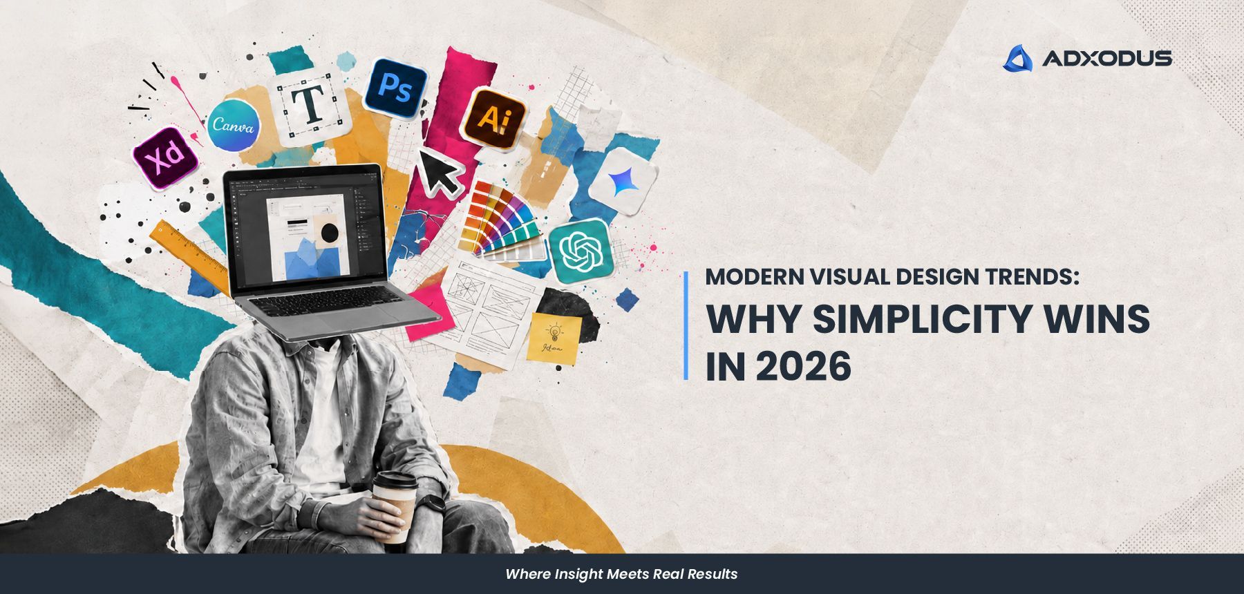
From our creative designer’s point of view, modern visual design trends in 2026 feel a bit different. Things are becoming simpler, but not in a boring or empty way. Things are becoming cleaner, clearer, and more intentional. We’ve been noticing that many brands are moving away from visuals that try to say too many things at once. Instead, there is more focus on stronger layouts, clearer messaging, and visuals that people can understand quickly. And honestly, it makes sense. People today scroll very fast. Between social media, websites, ads, and videos, attention spans are getting shorter. If a visual takes too long to understand, people usually move on before the message even lands. That is why simplicity is becoming more important. Not because it is “safe”, but because it communicates better.
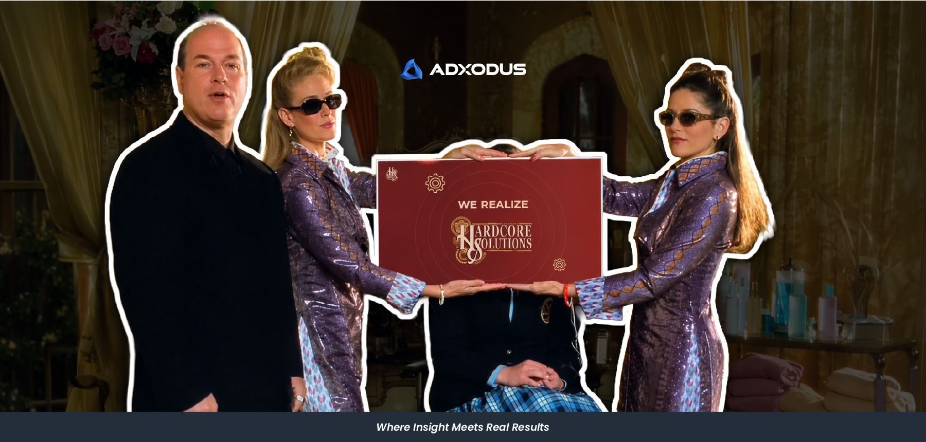
Learn more on how Adxodus revamped Hardcore Solutions’ website into a clearer, modern and more functional online experience for their event management brand
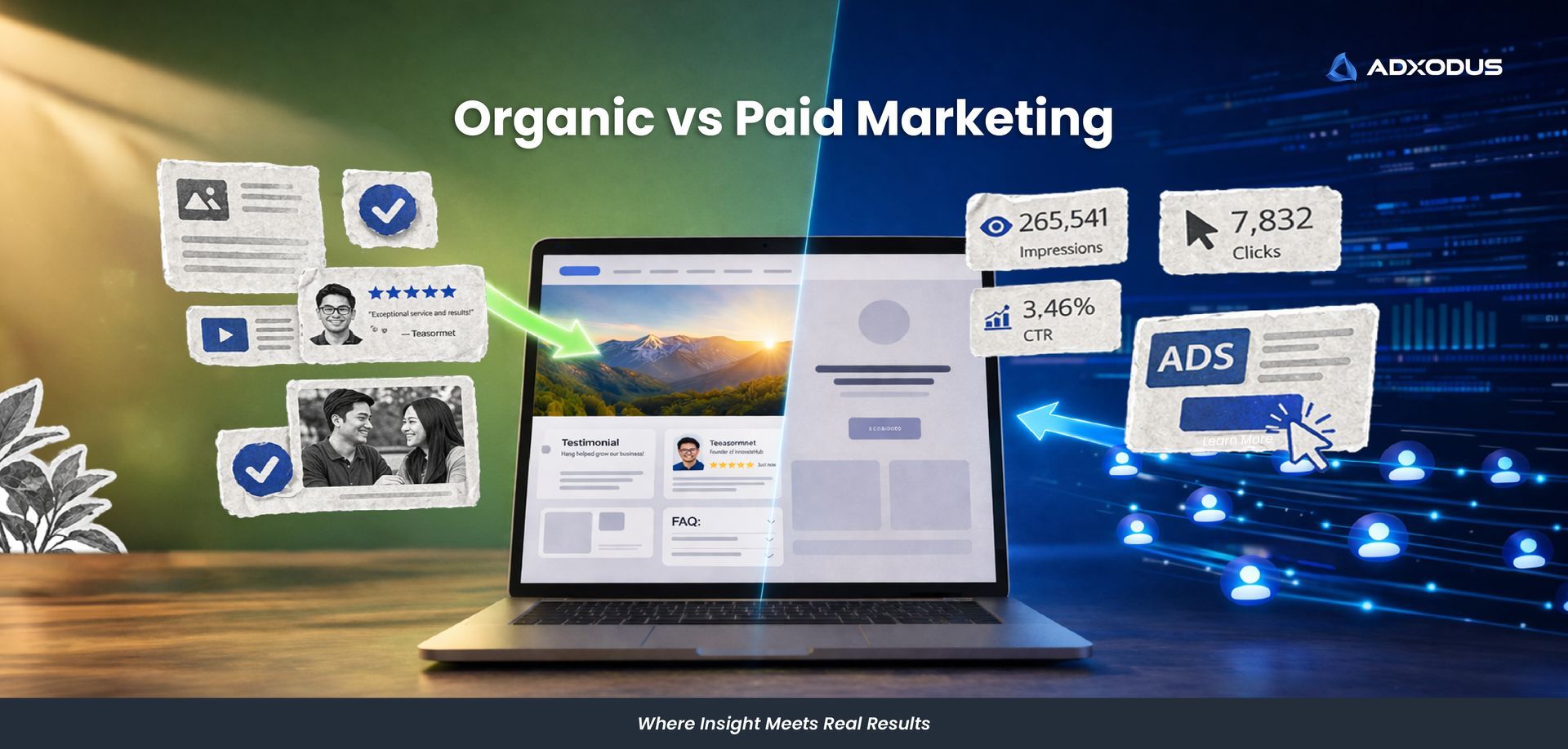
You run an ad. People click. Traffic comes in. Then nothing happens. No enquiries, no real traction, just numbers moving without results. At that point, most businesses start questioning their targeting, budget or ad creatives. But there is one question that often gets overlooked. When someone clicks your ad, what do they actually see when they land on your page? This is where organic content becomes essential. Paid ads drive visibility, but visibility alone does not build trust. Organic marketing shapes how prospects evaluate your credibility once they discover you.
From our creative designer’s point of view, modern visual design trends in 2026 feel a bit different. Things are becoming simpler, but not in a boring or empty way. Things are becoming cleaner, clearer, and more intentional. We’ve been noticing that many brands are moving away from visuals that try to say too many things at once. Instead, there is more focus on stronger layouts, clearer messaging, and visuals that people can understand quickly. And honestly, it makes sense. People today scroll very fast. Between social media, websites, ads, and videos, attention spans are getting shorter. If a visual takes too long to understand, people usually move on before the message even lands. That is why simplicity is becoming more important. Not because it is “safe”, but because it communicates better.
Learn more on how Adxodus revamped Hardcore Solutions’ website into a clearer, modern and more functional online experience for their event management brand
You run an ad. People click. Traffic comes in. Then nothing happens. No enquiries, no real traction, just numbers moving without results. At that point, most businesses start questioning their targeting, budget or ad creatives. But there is one question that often gets overlooked. When someone clicks your ad, what do they actually see when they land on your page? This is where organic content becomes essential. Paid ads drive visibility, but visibility alone does not build trust. Organic marketing shapes how prospects evaluate your credibility once they discover you.