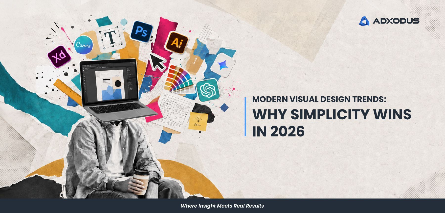

Modern Visual Design Trends: Why Simplicity Wins in 2026
This article has been written by Melissa Soliano

From our creative designer’s point of view, modern visual design trends in 2026 feel a bit different. Things are becoming simpler, but not in a boring or empty way.
Things are becoming cleaner, clearer, and more intentional. We’ve been noticing that many brands are moving away from visuals that try to say too many things at once. Instead, there is more focus on stronger layouts, clearer messaging, and visuals that people can understand quickly.
And honestly, it makes sense.
People today scroll very fast. Between social media, websites, ads, and videos, attention spans are getting shorter. If a visual takes too long to understand, people usually move on before the message even lands.
That is why simplicity is becoming more important. Not because it is “safe”, but because it communicates better.
Simple Design Is Actually Harder Than It Looks
One thing we always joke about internally is how people think simple design is easier to create.
Actually… sometimes it is harder.
When there are fewer elements in a visual, every detail matters more. Typography, spacing, colour balance, layout, and hierarchy all become much more noticeable. There is less room to hide weak design decisions.
For us, simple design is not about removing things randomly. It is about asking whether every element actually helps the message.
If it does not, then maybe it is just noise.
That is also why a lot of modern visual design today feels cleaner. Brands are realising that people do not want to process ten different messages at the same time anymore. They want visuals that are easy to absorb, especially on mobile.
Is Simplicity The Way Forward?
This shift towards simpler visuals also comes from how people use digital platforms today. Most users are on mobile. Most users are scrolling quickly. And most users decide within seconds whether they want to keep looking or not.
As designers, we can really feel this change. A social media design, website banner, or ad visual cannot depend on people taking their time to “figure it out”. The message needs to land almost immediately, especially when it is competing with so much other content on the same screen.
That does not mean every design needs to look plain or overly minimal. It just means the communication needs to be clearer. We’ve noticed that visuals with stronger hierarchy, cleaner layouts, and clearer focal points tend to work better because people understand them faster. And let’s be honest, nobody is stopping during lunch break to decode a complicated post.
The Design Trends We’re Seeing More in 2026
A lot of the visual design trends we’re seeing lately actually support this move towards simplicity. Instead of visuals that feel overly packed, more brands are leaning into design choices that feel cleaner, sharper, and easier to understand.
Some of the trends we’re noticing include:
- Cleaner and bolder typography that helps the main message stand out faster.
- More breathing space in layouts so visuals do not feel too crowded.
- More intentional colour choices instead of using too many loud colours at once.
- Clearer focal points that guide the audience to what matters first.
- Selective use of motion, 3D elements, or illustrations so they support the message instead of overpowering it.
- Stronger mobile first design thinking where text, spacing, and layout are planned for smaller screens from the start.
Interestingly, simpler visuals often end up feeling more premium too. Sometimes removing the extra noise is exactly what makes the important parts stand out better.
How We’ve Been Applying This In Our Own Visuals
As designers, these are also things we’ve been applying more intentionally in our own work lately.
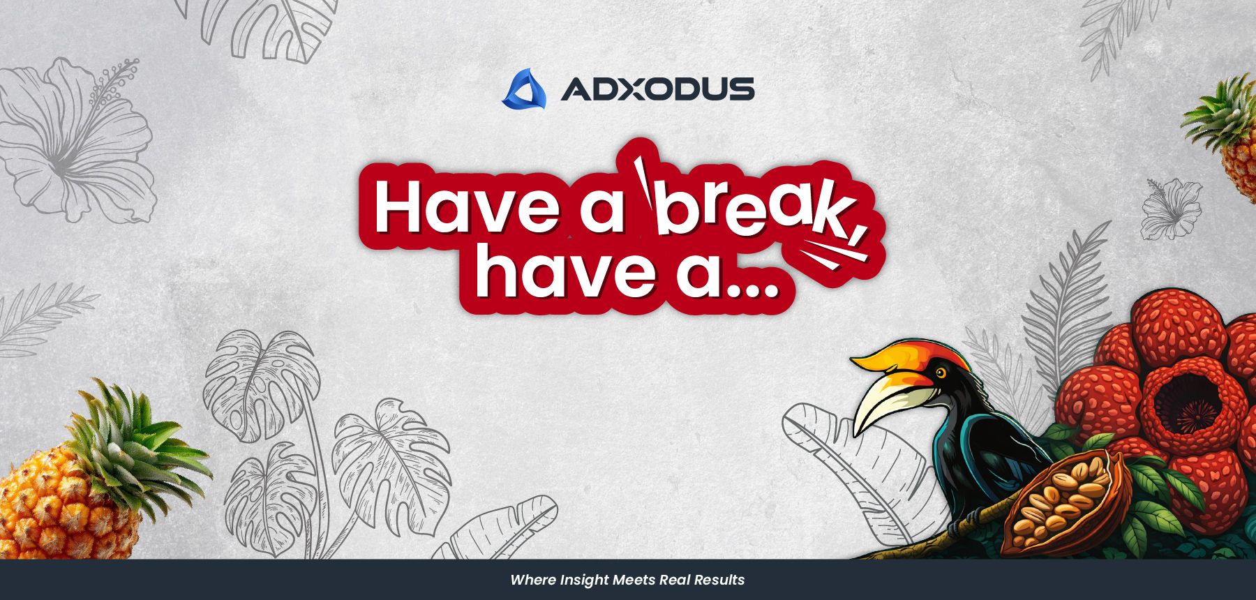
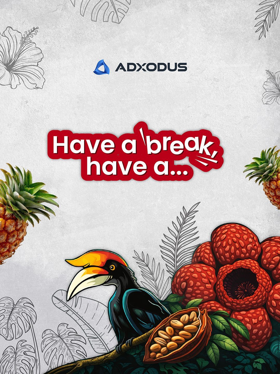
For our KitKat hyperlocalisation visual, the focus was on keeping the composition clean while letting the local storytelling elements stand out naturally. Instead of overcrowding the design, we used strong focal points like the hornbill and tropical elements while keeping the background softer and more subtle. The visual still feels rich, but the message remains easy to absorb quickly.
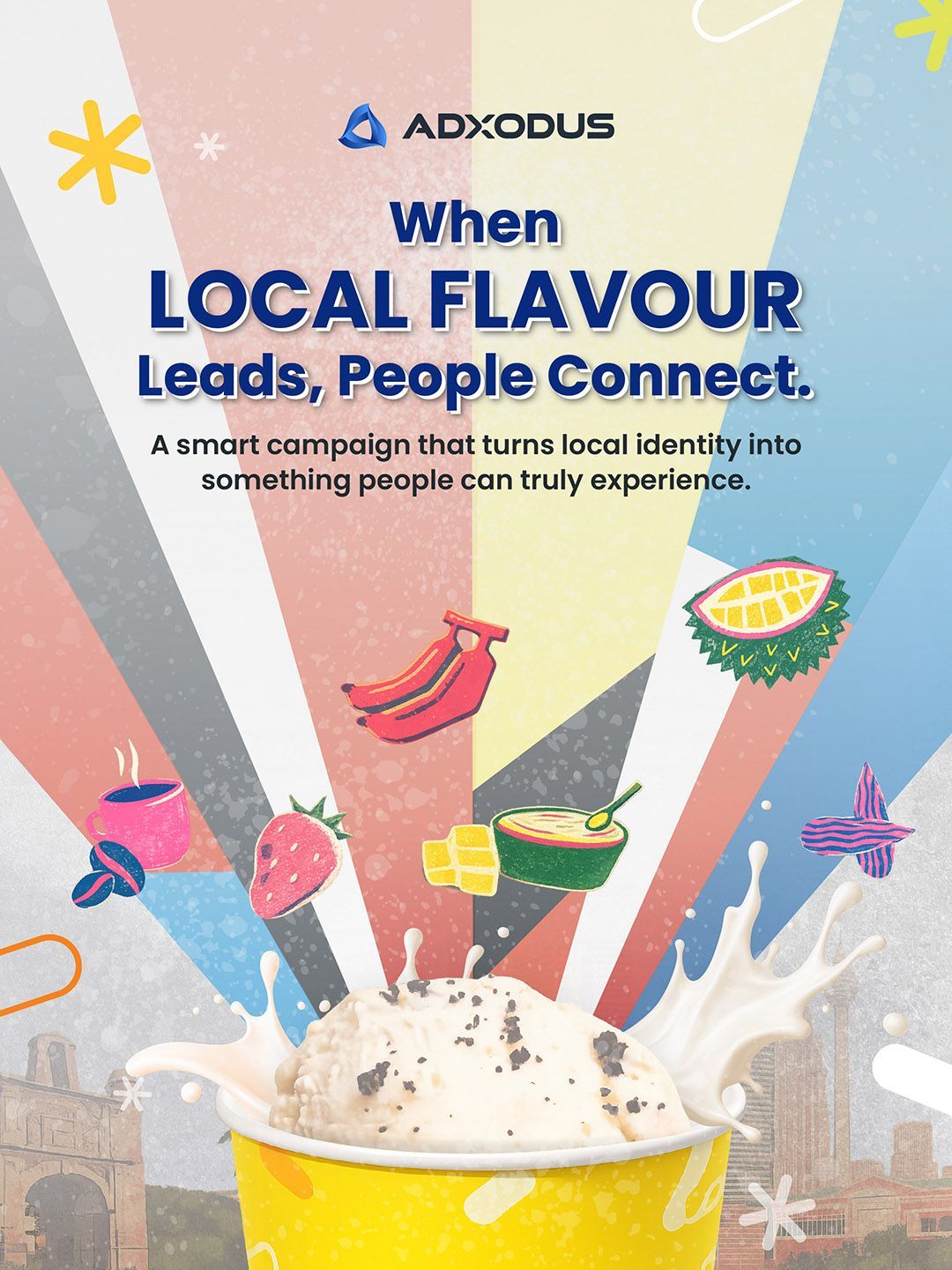
For the Inside Scoop visual, we leaned more into bold typography and playful spacing. Even though the layout contains multiple local flavour elements, the hierarchy still guides the eye clearly towards the main message first. The colours are vibrant but controlled enough to avoid visual overload.
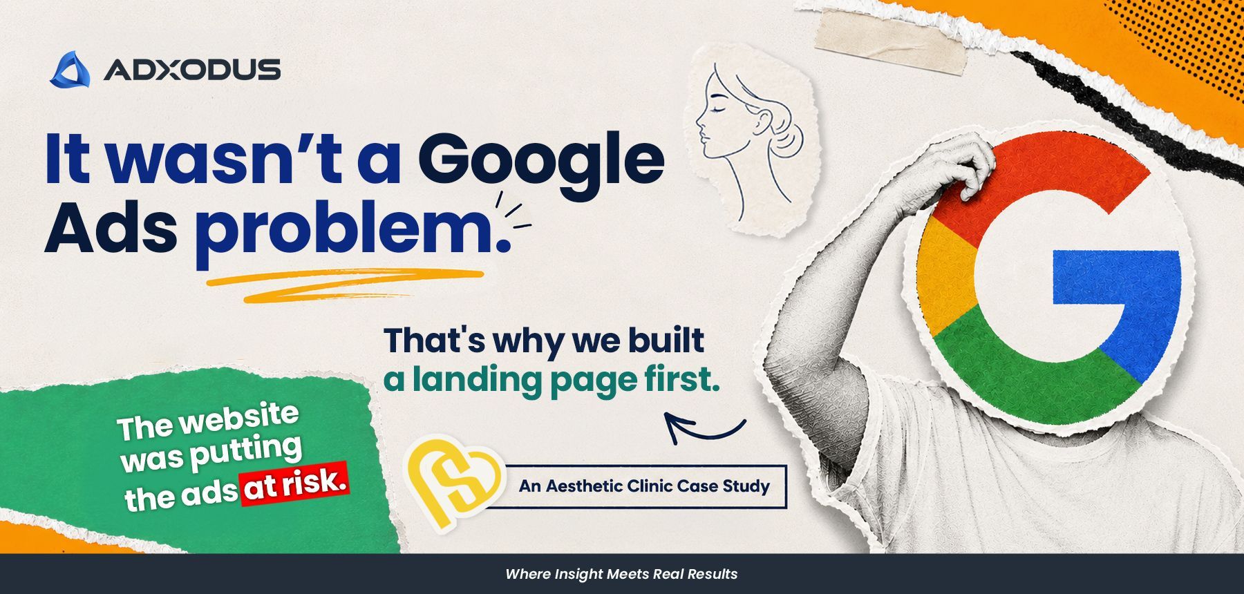
Meanwhile, for our Labour Day visual, the direction was even simpler. A large bold headline, a strong focal shape, and clear composition helped the message land almost instantly while scrolling. Even with playful object swaps like the camera and basketball heads, the layout still stays easy to process because the design knows exactly where it wants audiences to look first.
Across all three visuals, the goal was never to make things look empty.
It was to make the communication feel clearer.
Why Simplicity Wins
At the end of the day, simplicity wins because it helps communication work better. Clearer visuals help audiences understand faster. They create stronger focus, better readability, and a smoother viewing experience across both desktop and mobile platforms.
From our side, we’ve realised that the strongest visuals are usually not the ones trying to show everything at once. They are the ones that know exactly what they want people to notice first.
Because in 2026, simplicity is not about doing less. It is about making every design decision count.
Share this article