


Learn how Adxodus built a landing page for an aesthetic clinic before running Google Ads, improving SEO structure, keyword focus, user flow, and campaign readiness.
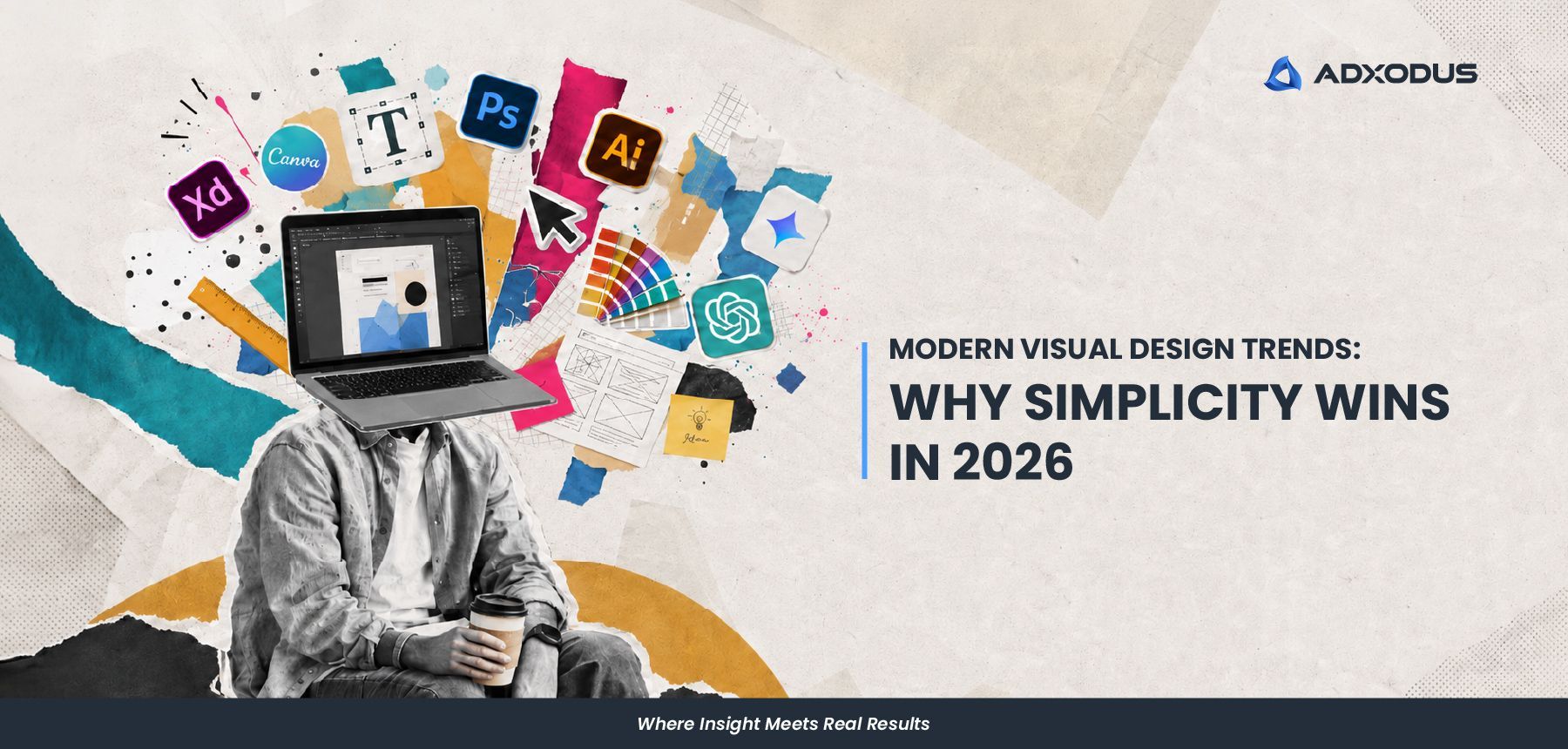
From our creative designer’s point of view, modern visual design trends in 2026 feel a bit different. Things are becoming simpler, but not in a boring or empty way. Things are becoming cleaner, clearer, and more intentional. We’ve been noticing that many brands are moving away from visuals that try to say too many things at once. Instead, there is more focus on stronger layouts, clearer messaging, and visuals that people can understand quickly. And honestly, it makes sense. People today scroll very fast. Between social media, websites, ads, and videos, attention spans are getting shorter. If a visual takes too long to understand, people usually move on before the message even lands. That is why simplicity is becoming more important. Not because it is “safe”, but because it communicates better.
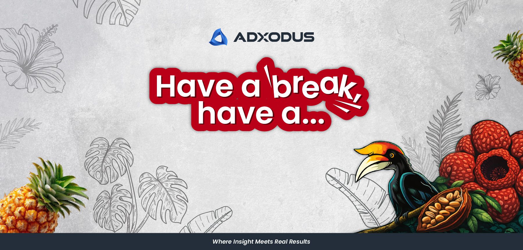
Explore Adxodus’ take on KitKat hyperlocalisation and the creative thinking behind our visual design, from local elements to storytelling.
Learn how Adxodus built a landing page for an aesthetic clinic before running Google Ads, improving SEO structure, keyword focus, user flow, and campaign readiness.
From our creative designer’s point of view, modern visual design trends in 2026 feel a bit different. Things are becoming simpler, but not in a boring or empty way. Things are becoming cleaner, clearer, and more intentional. We’ve been noticing that many brands are moving away from visuals that try to say too many things at once. Instead, there is more focus on stronger layouts, clearer messaging, and visuals that people can understand quickly. And honestly, it makes sense. People today scroll very fast. Between social media, websites, ads, and videos, attention spans are getting shorter. If a visual takes too long to understand, people usually move on before the message even lands. That is why simplicity is becoming more important. Not because it is “safe”, but because it communicates better.
Explore Adxodus’ take on KitKat hyperlocalisation and the creative thinking behind our visual design, from local elements to storytelling.